


You are viewing your 1 free article this month. Login to read more articles.
ABCD 2020: Lucie Stericker on designing Queenie
The seventh annual Academy of British Cover Design awards, known as the ABCDs, is this year being announced virtually, in lieu of hosting a physical event. Two winners are announced each day this week (commencing 19th October) by the organisation’s Twitter account and Instagram feed.
The seventh annual Academy of British Cover Design awards, known as the ABCDs, is this year being announced virtually, in lieu of hosting a physical event. Two winners are announced each day this week (commencing 19th October) by the organisation’s Twitter account and Instagram feed.
The awards recognise excellence in UK-based cover designers; the criteria for this year’s awards was any book published between 1st January and 31st December 2019 (e-books are admissible). In order to promote inclusion and a breadth of entries, entry is free for designers, who may submit their own work or that of a fellow designer.
Awards will be given in ten categories this week—Children’s 0-5, Children’s 6-12, Young Adult, SciFi/Fantasy, Mass Market, Literary Fiction, Crime/Thriller, Non-fiction, Series Design and Classic/Reissue—with the initial entries whittled down to a shortlist by a number of book- and design-industry insiders.
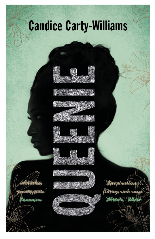
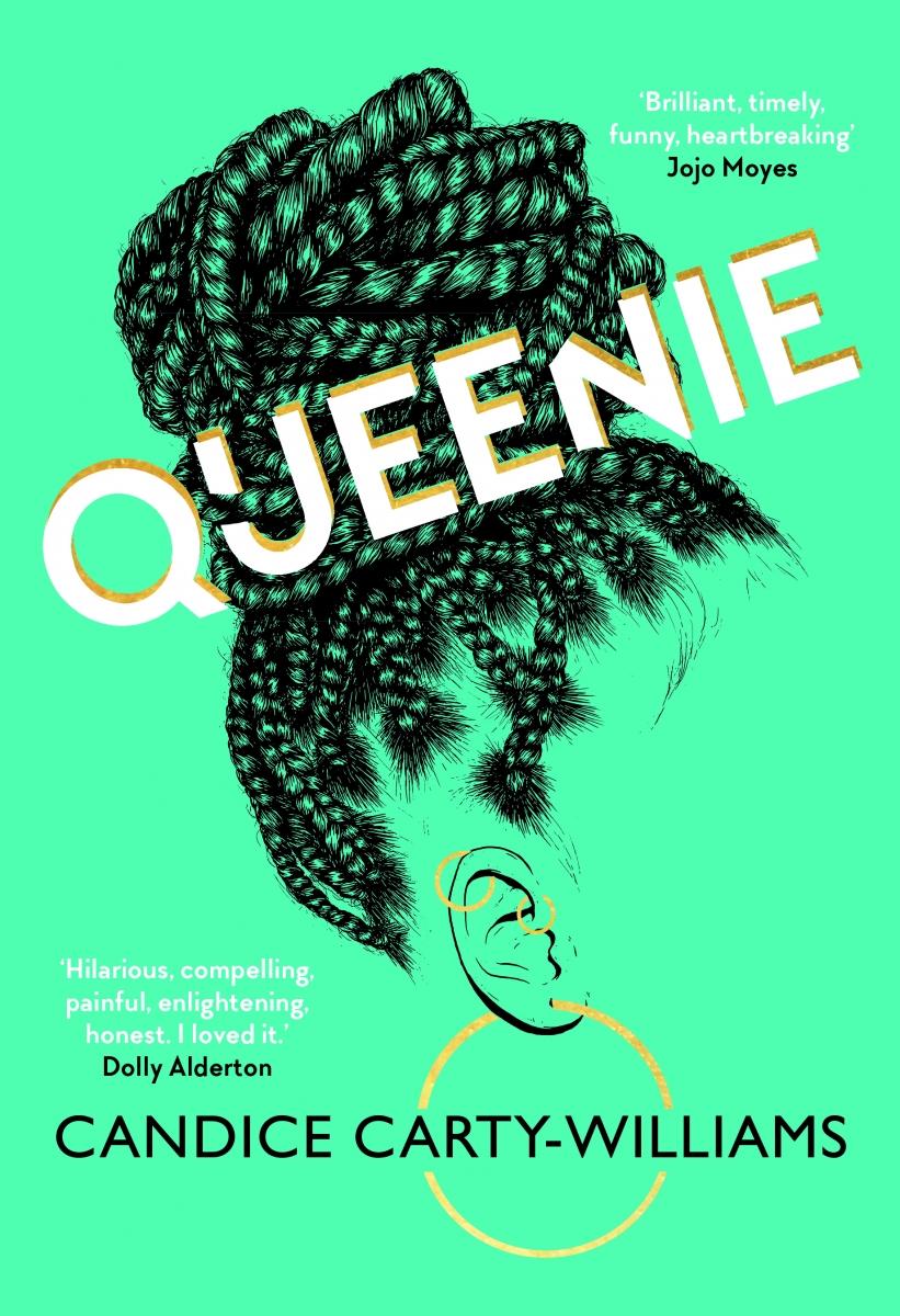
This afternoon the final award, Mass Market, was won by Lucie Stericker for her work on Candice Carty-Williams' Queenie. The Bookseller caught up with Lucie to find out how she came up with the winning design...
First off, can you tell us a little about yourself, and how you landed in the world of book design?
I’ve always loved books. I came to them later than most avid readers, but once I got the bug, there was no stopping me. While studying it just seemed a natural fit, so I based a lot of my projects around book covers. I managed to get a job at HarperCollins straight after leaving education, which started me off on my career. I came to Orion 22 years ago, which was then a small independent publisher.
Moving onto your winning cover, can you tell us a little about the brief you received?
Queenie was briefed as "Zadie Smith meeting Lena Dunham". I was lucky enough to be able to read a draft, while on holiday—I totally loved it and understood exactly why Katie Espiner (our managing director) was shouting about it to everyone and anyone. It’s always nerve-wracking working on a title the whole company is so excited about. Our marketing team did such a great job and their copy really sums up who Queenie is—Journalist/Catastrophist, Expressive/Aggressive, Funny/Dramatic, Loved/Lonely Enough—she is a deeply complex character, and everyone that has read it loves her.
How did you go about creating the cover?
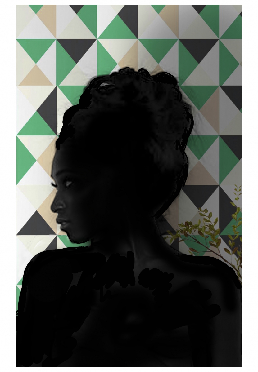
As our heroine is everything in this book, I really wanted to portray her but not be too descriptive of who she is, letting the reader create her themselves. At first I wanted to do a photoshoot with Queenie in silhouette, but I felt the graphic silhouette had been done so much at the time, so I mocked-up various option using found images. I knew my Queenie wasn’t right, but I wanted to get an idea across before we could do a shoot using a model who was closer to Queenie's beautiful shape.
At the same time, the US publisher was working on their cover with artist Gerrel Saunders. The idea of Queenie lost, vanishing, missing was exactly as I had been thinking, and we all loved Gerrel’s illustration... but we weren’t keen on their design.
Can you share any alternatives or ‘killed covers’ for the project?
I wanted to go bright, but I also wanted it to be slightly off-kilter. To me this reflected Queenie, whose life isn’t a straight or easy line. I was also asked to try some serif type, which I thought just wasn't powerful enough.
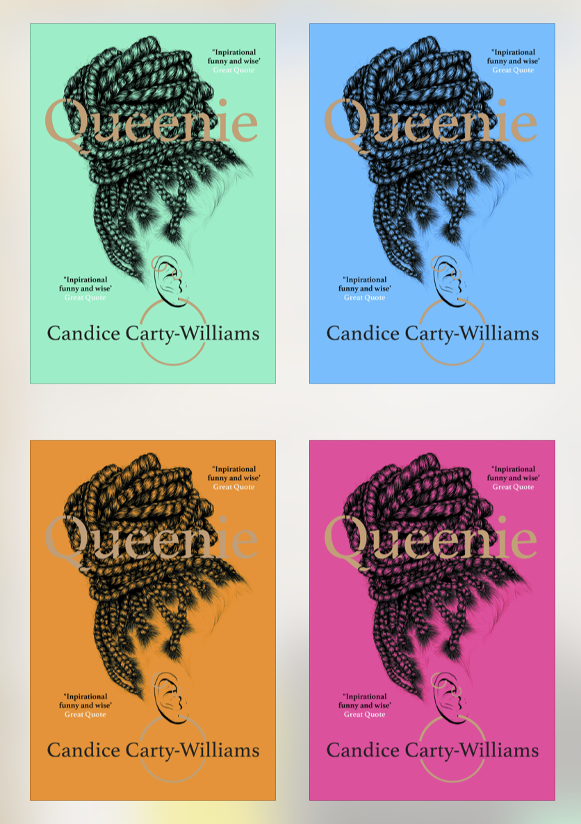
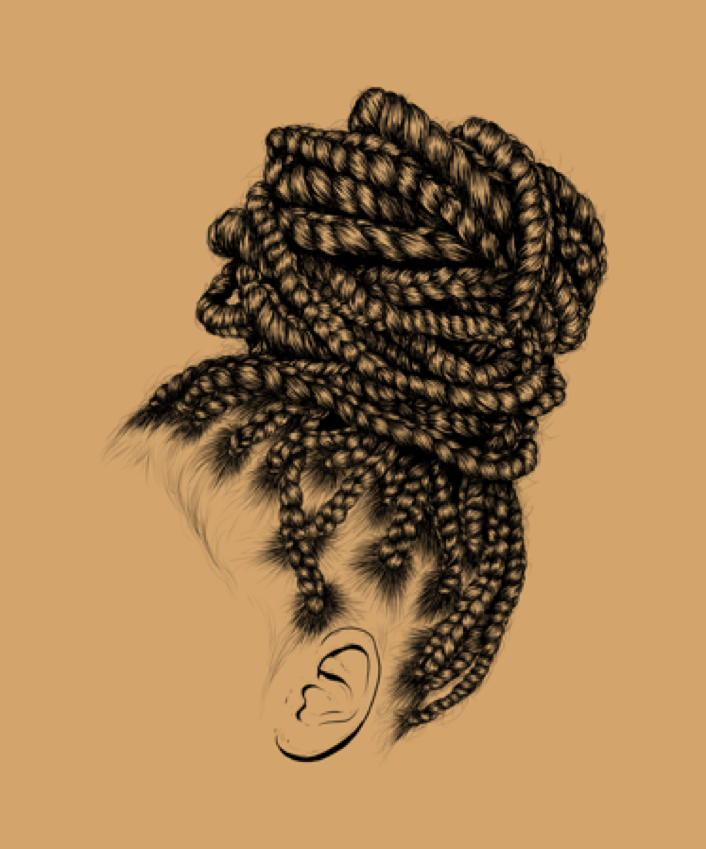
But we all loved the idea of the many facets of Queenie shown through the different colour versions of both the hardback and paperbacks. It's not often we’re able to use so many special colours, but we did it in a very clever way. All of the different editions are printed from one file with just one Pantone change. Candice Carty-Williams loved my covers, and it’s always nice getting positive feedback from the author.
What has been your favourite project to work on in the past year?
It’s difficult to pick the best project I’ve worked on as it’s been such a strange year, but probably I would have to say, just for the joy of it, The Hairy Bikers' Veggie Feast. I had to set it all up in lockdown—c-oordinating the whole team of stylists, photographers, editors, agents and of course the boys; everyone at home all over the country and obeying government guidelines at all times! I designed the whole book of 288 pages and there were over 100 photos shot —and it all had to be done on a tight schedule, while keeping the team safe. The Bikers are some of the best people to work with (if not the best), they work hard but they always make it fun, so it was a really wonderful break in a pretty bleak Covid year. Andrew Hayes-Watkins, the photographer, was totally brilliant too and he is always a delight to work with. In fact, the whole team was brilliant!
Which book would you most like to design a cover for?
I’ve been lucky enough to design covers for lots of my "hero" authors. Margaret Atwood is one of my favourite authors (especially the Oryx and Crake series), but her covers are beautifully designed anyway!
If you could change one thing about your job, what would it be?
That there were 25 hours in a day! It would always be great to have more time!
To her more from Lucie, follow her on Twitter.


